Overview
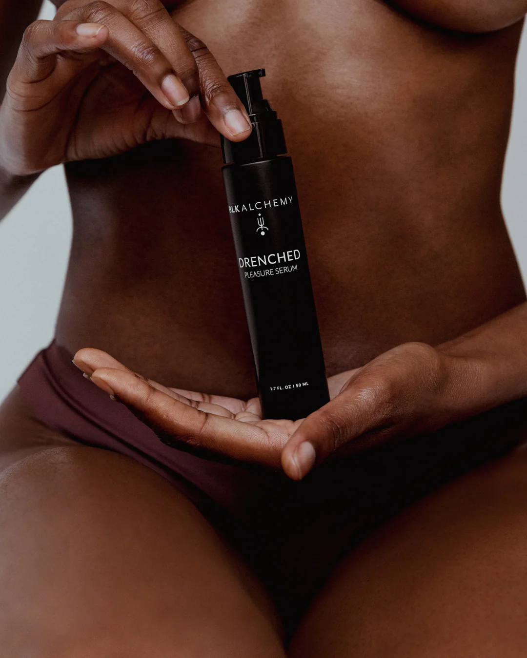
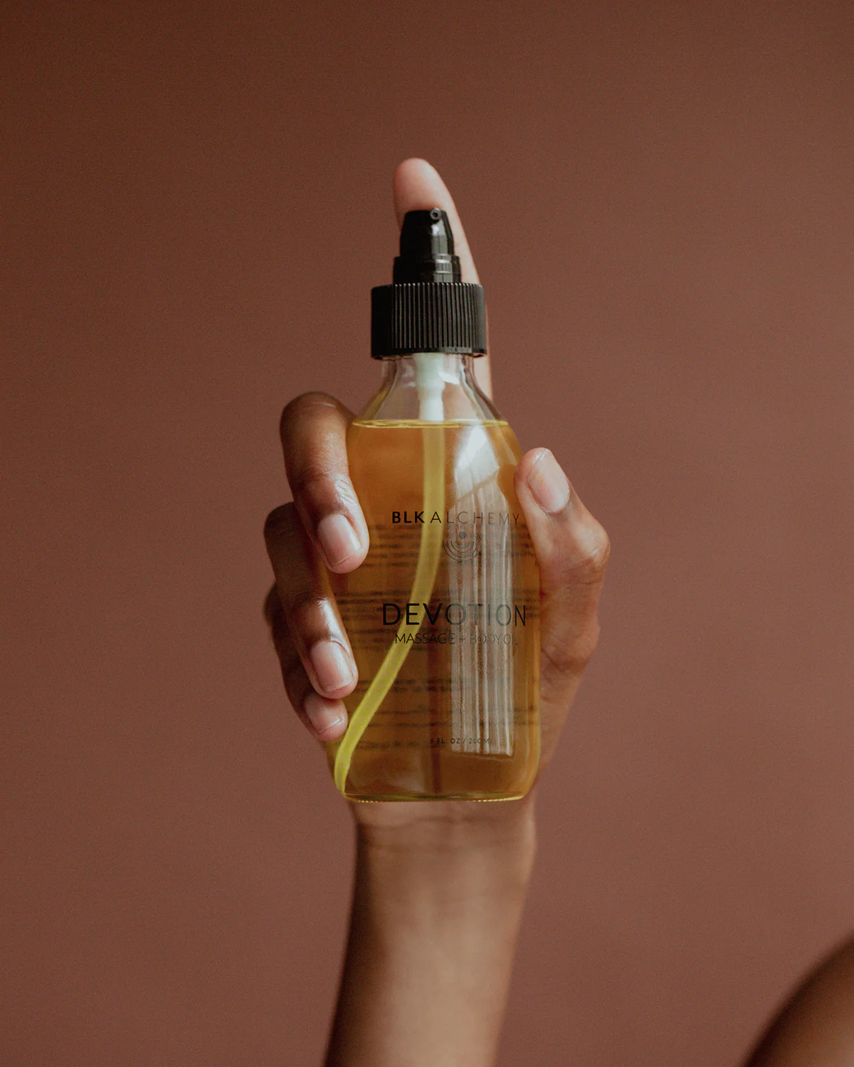
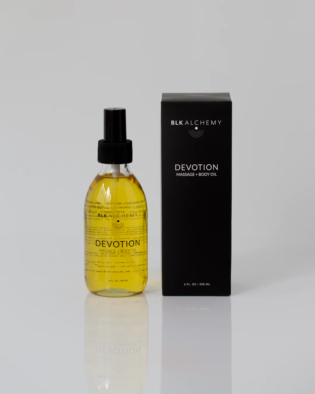
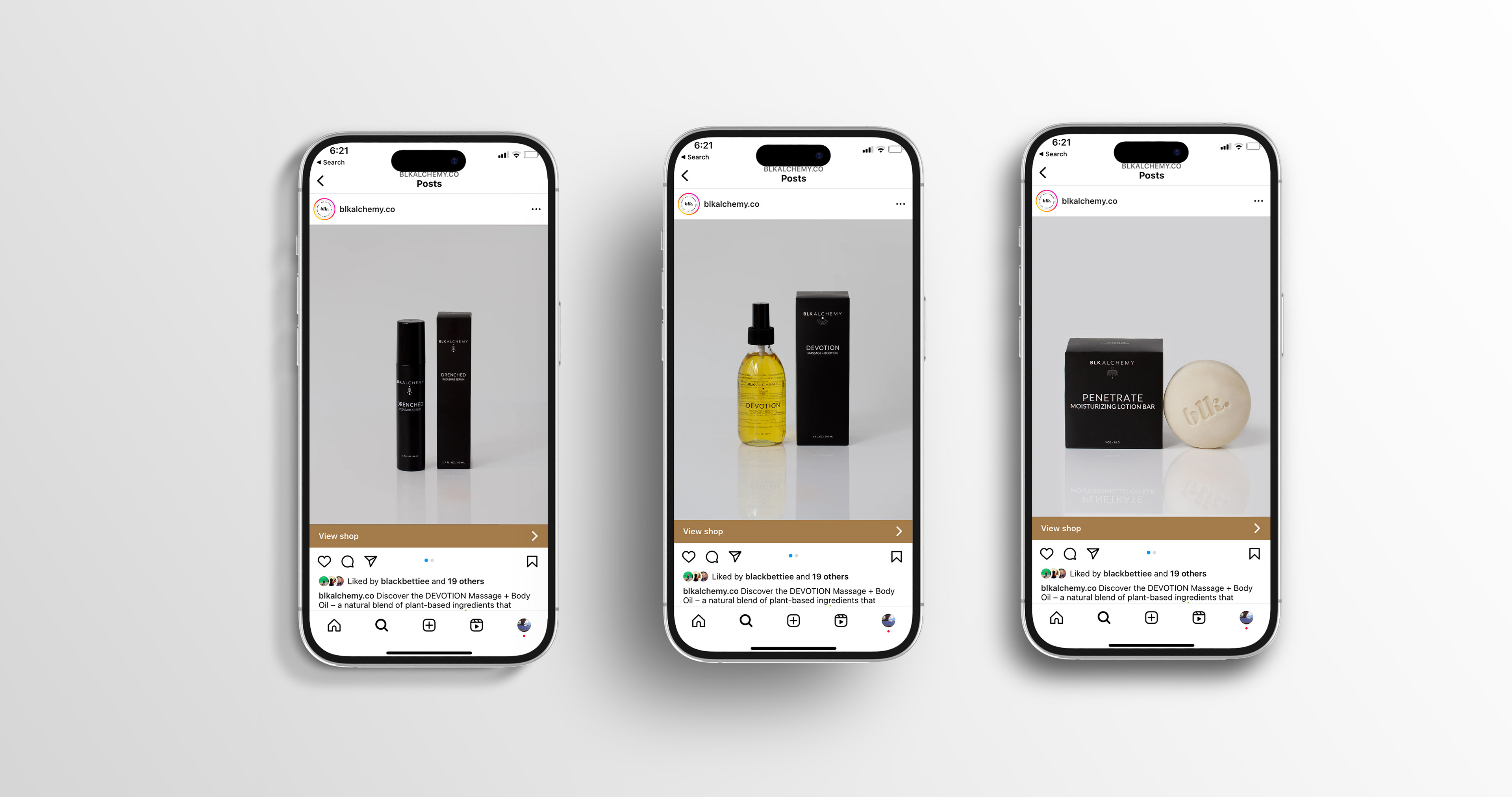
A Black woman-owned skincare brand was launching its first collection of body care products formulated for melanated skin, including products designed for intimate use. Working from an existing logo, I developed the visual language for the product labels and outer packaging with an emphasis on simplicity, refinement, and consistency.
Challenge
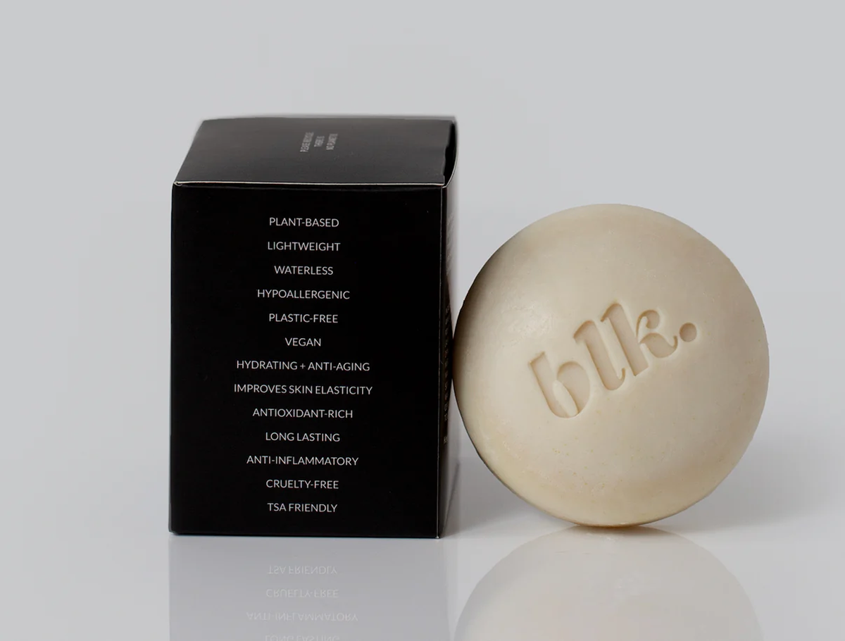
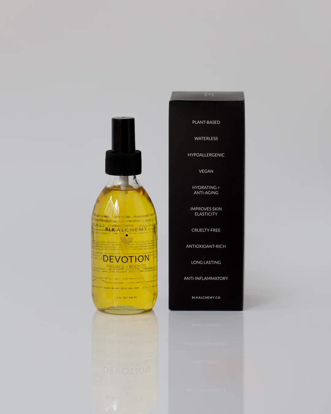
The packaging needed to accommodate a significant amount of product information, including ingredients, benefits, and supporting copy, across bottles and boxes of varying sizes. The challenge was creating a clear information hierarchy without compromising the minimal aesthetic.
Approach
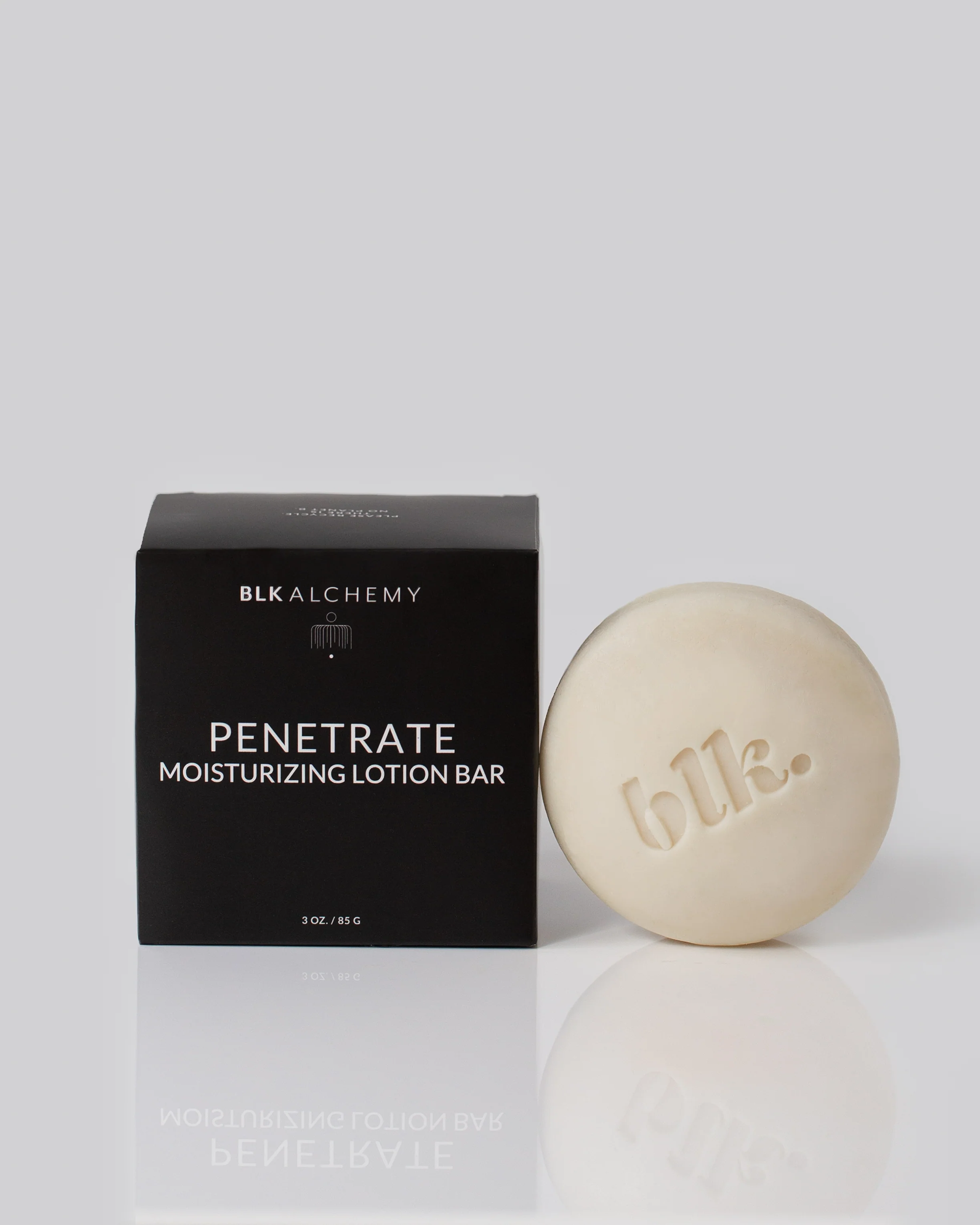
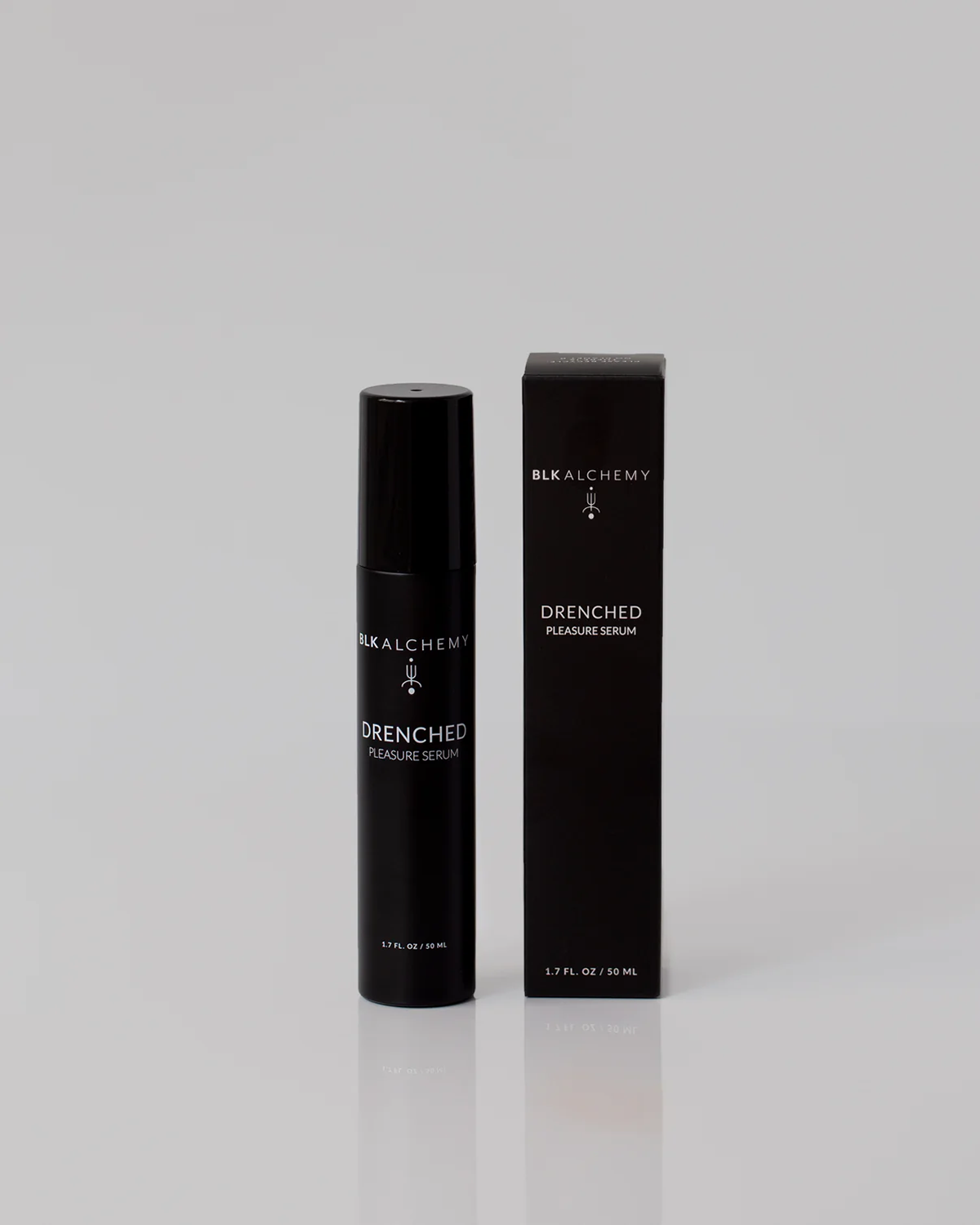
I developed a restrained black-and-white system that connected the packaging to the brand's identity and referenced the strength and richness of Black culture. Fine, elegant typography echoed the linework of the existing logo, while consistent centered layouts established a repeatable hierarchy across the collection.

I worked directly with the stakeholder to edit and refine copy where necessary, balancing messaging with legibility. Using supplied dielines,
I adapted the system across package formats while accounting for folds, bleed, type safety, and production requirements.
I adapted the system across package formats while accounting for folds, bleed, type safety, and production requirements.
Outcome
The result was a cohesive, scalable packaging system that maintained a consistent brand presence across multiple products and formats.
The collection successfully launched online, with positive feedback from both the client and their customers.
The collection successfully launched online, with positive feedback from both the client and their customers.
Brand Overview
Focusing on sensitive skin and wellness, this line of clean skincare is water based, vegan and hypoallergenic. We wanted the packaging and typeface to reflect the same clean look and feel.