Overview
As The Home Depot prepared to move from image-based promotional typography to live web text, the digital team needed a proprietary typeface that could support the transition without ongoing font licensing requirements. The change would also support accessibility, SEO, image optimization, and the site's future responsive redesign.
Challenge
Working from a highly legible typeface selected by my art director, I was tasked with creating distinctive letterforms that maintained strong screen readability while establishing a typeface unique to The Home Depot.
Approach
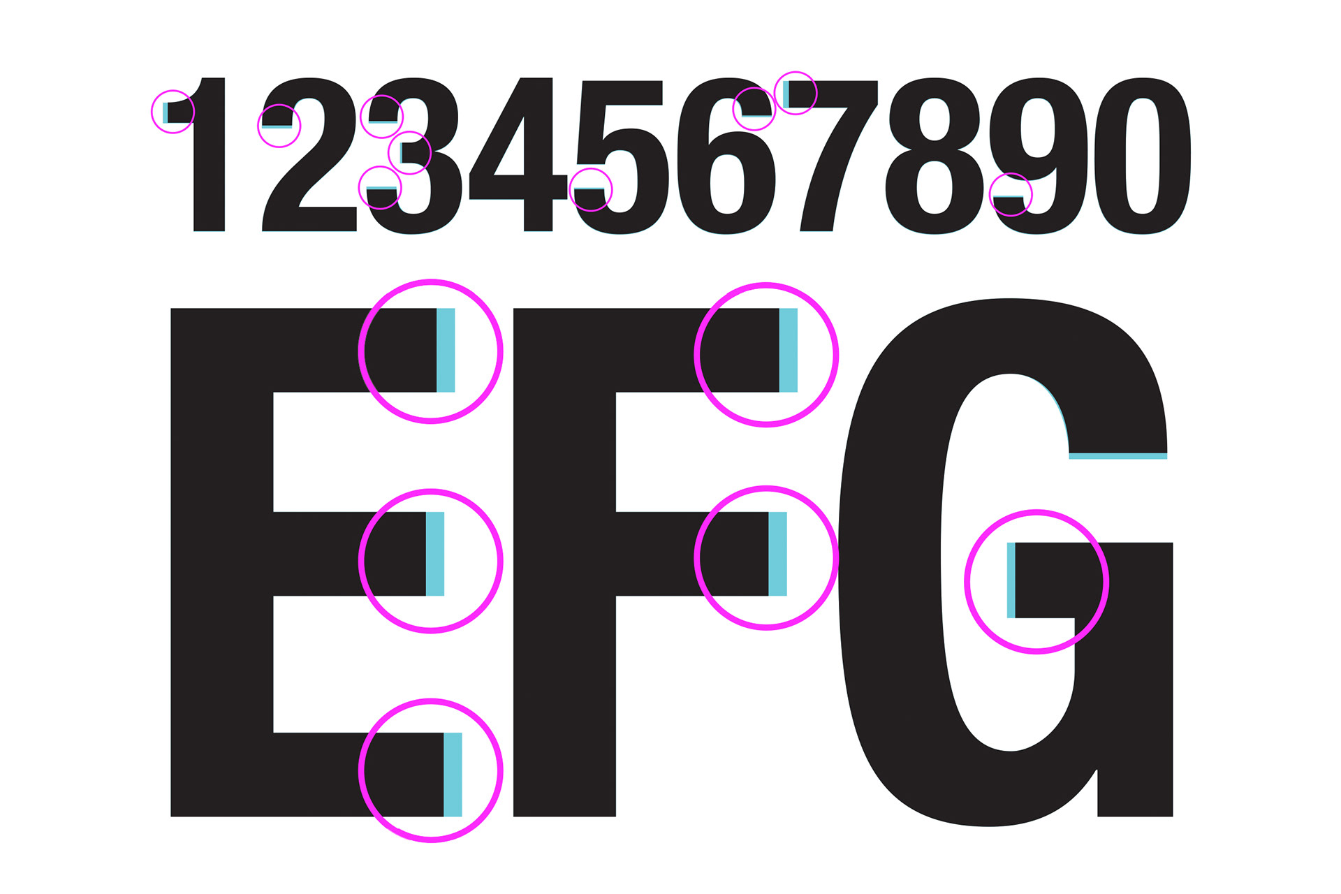
I redrew the character set in Illustrator, refining counters, apertures, bowls, eyes, stems, and other details to differentiate the typeface while preserving legibility. I then learned FontLab to translate those letterforms into a functional font.
We tested iterations across device resolutions and compared frequently used words side by side. After launch, I worked closely with front-end development to identify and refine kerning pairs as issues surfaced in real site content. Following the successful implementation of the first weight, I helped develop a second.
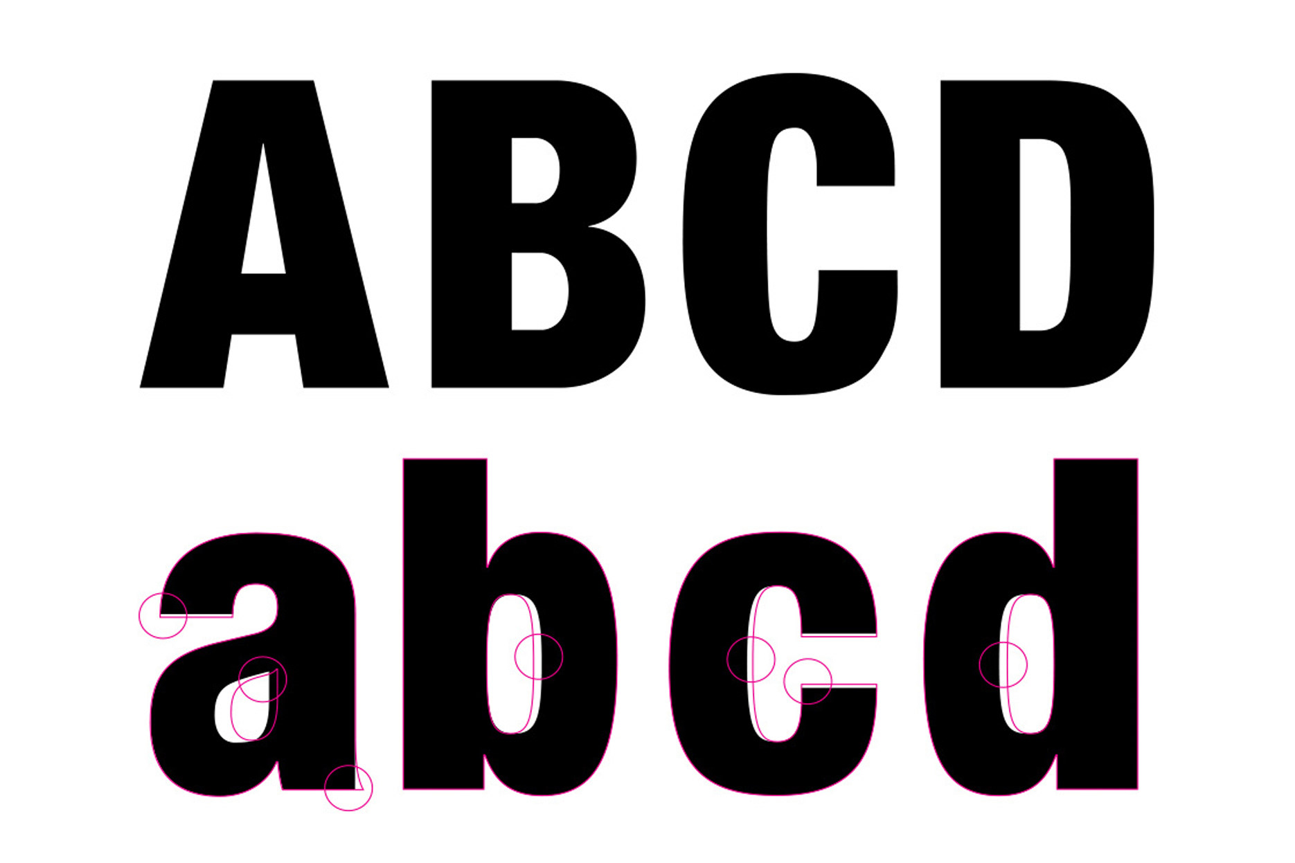
The magenta markups on the lowercase glyphs, highlight the customizations made to the original typeface.
Outcome
Named Homervetica, a combination of The Home Depot's Homer mascot and the source typeface, the resulting two-weight family included uppercase and lowercase characters, numerals, punctuation, and selected glyphs.
Homervetica replaced image-based hero typography across U.S. homepage, category, and banner experiences and was subsequently adopted by The Home Depot's Canadian and Mexican sites.
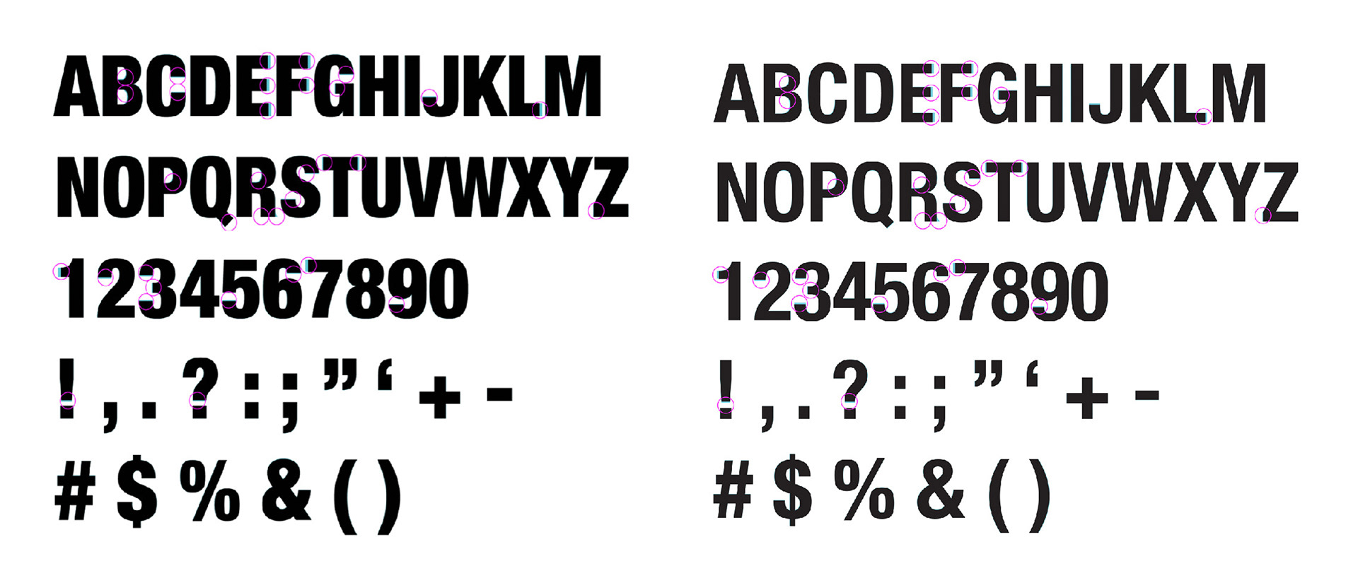
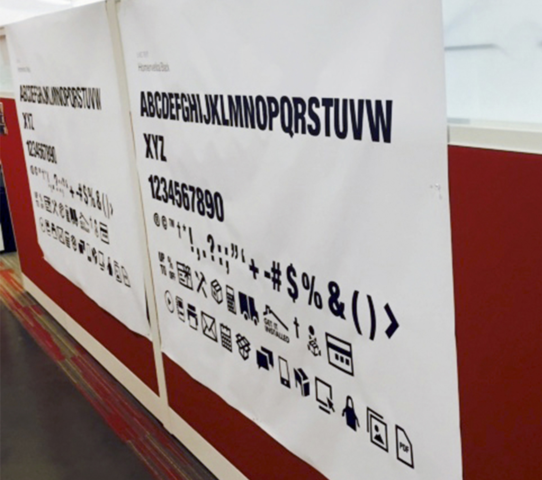
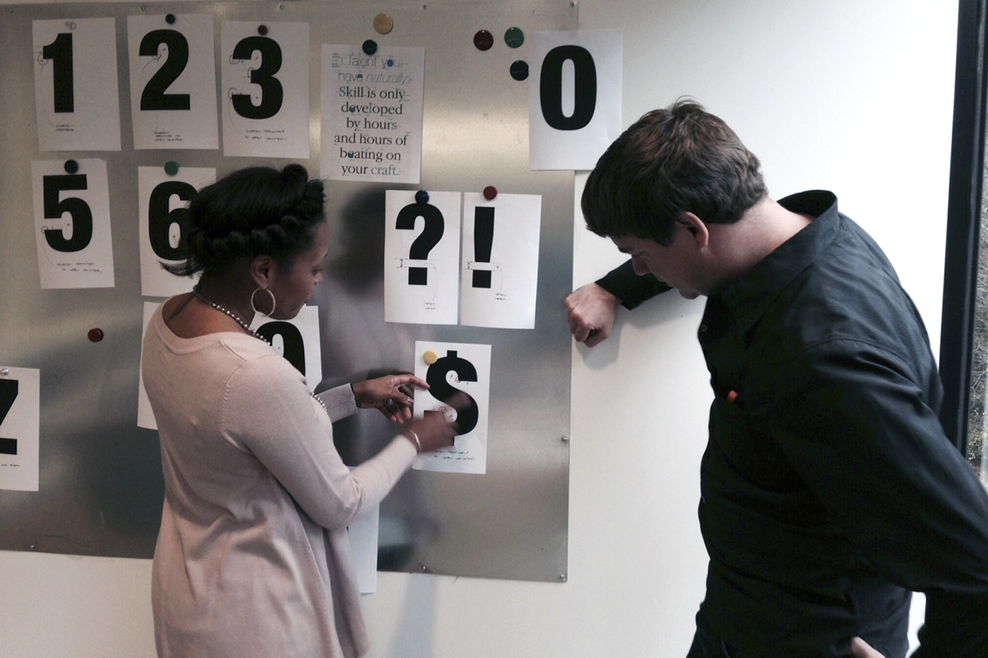
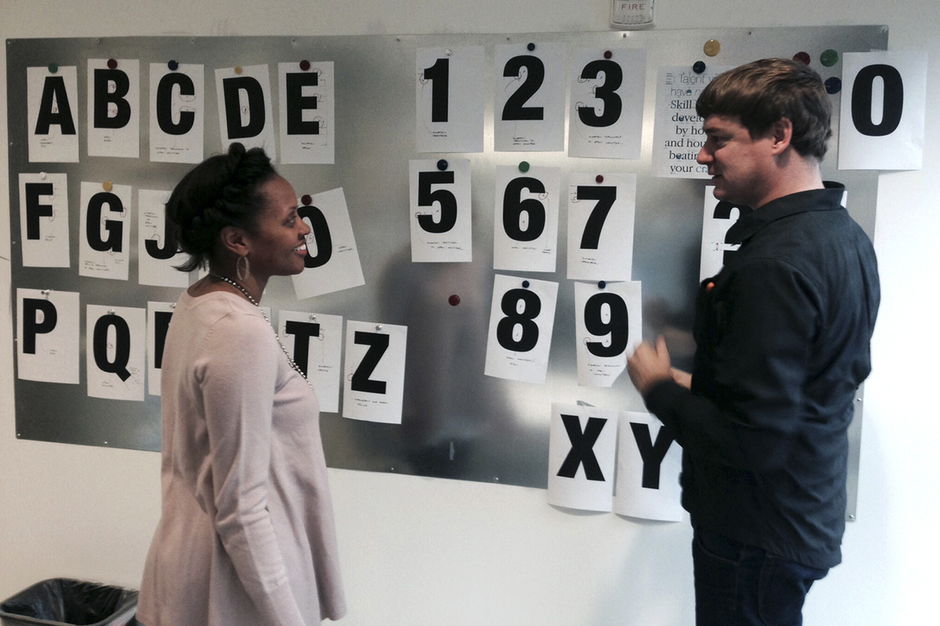
Modifications to Black typeface (left) and the Medium (right)